I was afraid that Call of Duty fanboys would spam the votes in their favour, so I guess I should be grateful it didn't come to that. But we're talking about my favourite video game here. It doesn't mean what's going to be there when this exhibit happens will be bad, in fact it's a pretty swell lineup on display. I'm not saying people should have only voted for MY favourites instead of theirs. Dems the breaks, I get that. I can still be pissed off about it.
One suggestion for why this happened was supplied to me by a fellow at deviantArt:
Well, Earthbound really deserved a place, but I think ALTTP deserves the place over Chrono Trigger in the art department which was the judging point. CT is one of the best games of all time, but I do think ALTTP is better looking and was more of a break-through in graphics and art direction.
Look, I've got a bit of a background with doing... er, backgrounds. The 16x16 tiled pixel backgrounds of video games, specifically. I like to think I have a good eye for this sort of thing, but I also think I don't NEED a good eye to see why that's such a bizzare thing to say about these two games.
I can get if some of you reading this played "A Link To The Past" first. I can understand if that game and you share a greater quantity of fond memories. I can get if you connected with it on a more personal or enjoyable level, or if you think it's a better game to play than Chrono Trigger, or if adventure games are preferable to you than JRPGs.
But if we are judging these games entirely on their aesthetic merits(which I'm not sure is the point of the Smithsonian, or this particular exhibit), then no, I'm sorry guys but Chrono Trigger wins.
It's not even a fair comparison! ALTTP was made in the early days of the Super NES era, when people were still getting the hang of 16-bit development tools. Chrono Trigger was made at the tail-end of the SNES' lifespan, when Squaresoft was at the top of its game with pixelated visuals. They hired an actual, established artist to craft the game's entire look and feel, and packed the game with a staggering amount of detail and personality that even today's big-budget 3D titles can't seem to reproduce.
Do you want examples? Let's take a look at how both games tackled similar visual subjects, starting with a generic neighbour's home:
An underground sewer:
A spoo-ooky castle dungeon:
A view of the clouds from a mountain peak:
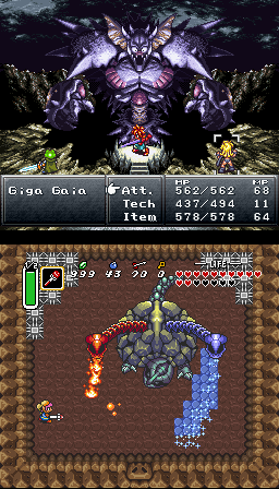
A three-tiered boss battle:
A forest:
A climactic battle:
An insanely detailed stain-glass-window courtroom scene with banners packed with onlookers:
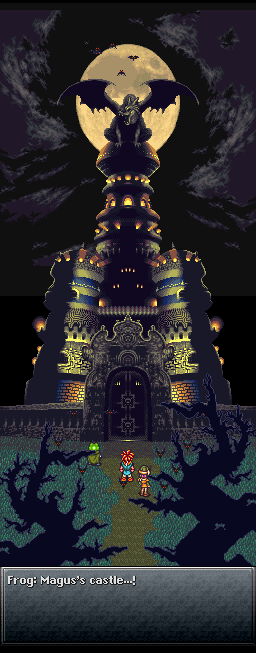
And holy shit a fucking goddamn dragon castle in the light of the moon:
For some reason, I couldn't find a visual reference of ALTTP's badass haunted lair. Oh well. I'm sure it's just as good.
I understand that personal preference is subjective and all that, but really look at those two games. Really stop and consider how ALTTP's tiles are almost all flat shades, while CT's actually takes light-sources and depth into account. Perhaps simplicity makes things overall easier, or at least quicker for the human eye to determine, and thus might help make the game slightly easier to play. But is that "better"? Really LOOK at those screens, and ask yourself which has the more "ground-breaking art design".
I tried to sprite trees the way they are in Chrono Trigger, once. To get the lighting and the details down and still have it look vaguely tree-like. By the end, I was a whimpering puddle of failure. I can't imagine I would experience this much resistance with A Link To The Past's trees. It's practically 4 or 5 colours, broadly assigned without a definitive light source. These were very basic visuals because this was at a time where game companies were still used to making flat, 8-bit sprites. Which one of these two products looks like the graphics could have been accomplished by a small child, or someone without experience with pixel art in an afternoon?
One of these games had different colour schemes for their caves to show whether or not it was illuminated by torchlight or underwater. The other game has different-coloured 16x16 blocks C+P'd over and over again. One of them depicts a kitchen with a sink, plates, dishes, dishwasher, plants, drapes, different glasses, different plates, bread, table mats, carpets, chairs, stools, chests, shoes, different shoes, a nook to place those shoes, knives, forks, and even photos on the fridge.
The other has some pots, and some OTHER POTS.
One of these games was made to look as best as they could manage at the time. The other was made in 1991.
~~~~~~~~~~~~
CONCLUSION:
~~~~~~~~~~~~~
Am I really supposed to believe that the definitive reason people voted en-mass for ALTTP, was because they thought it was better-looking?
Seriously?
I can believe that Zelda fanboys would be distraught if their subject of worship weren't featured FIVE TIMES in the same exhibit. And that they would unite to mass-vote the same game they've been playing for twenty years over games that actually said something. Just because it's a Zelda game, and that's what they like.
What I can't believe is that all of those people are also blind.
If you'd like to read more on the subject of CT's awesome fucking spritework, Pat spoke about this in his writeup of Chrono Trigger, and did so with much more eloquence and sensibility than I could. I hope some of you at the very least can find the time to skim that, brevity-be-damned. This guys knows what he's talking about.
(All screenshots courtesy of vgmuseum.com)
END OF LINE
~A.H.


No comments:
Post a Comment